Narrowband, Part One
By Jon Engelsman
September 18, 2020
Regarding a competition to label satellite imagery and identify cloud pixels for machine learning training data.
Part Two takes a more technical look at the inner workings of GroundWork, a web-based segmentation labeling tool used for that task.
An edited version of this post was published to the Radiant Earth Insights blog with the title “ Cloud-Spotting at a Million Pixels an Hour”
Narrowband
label (n.) ~ c. 1300, "narrow band or strip of cloth" (oldest use is as a technical term in heraldry), from Old French label, lambel, labeau "ribbon, fringe worn on clothes"
etymonline.com
Outreach Day
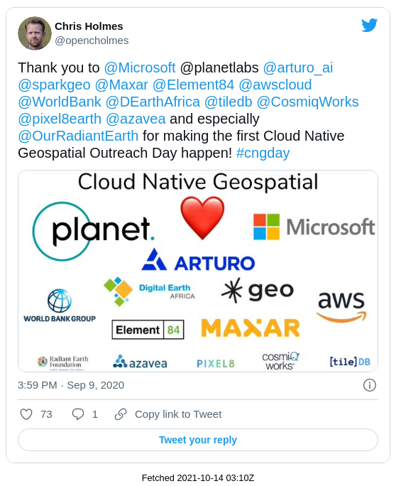
I recently attended the Cloud Native Geospatial Outreach Day, a virtual event designed to “introduce STAC, COG, and other emerging cloud-native geospatial formats and tools to new audiences”.
It was organized by Chris Holmes, a technical fellow at Radiant Earth, senior vice president at Planet and an all-around driving force in the open-source geospatial community. The event was sponsored by a collection of innovative companies working in the remote sensing and geospatial industries.
It was a great introduction to some cutting-edge geospatial data formats that are set to significantly improve the management of geospatial data in the cloud. Videos of all of the presentations from the event are freely available and if you’re into geospatial data, I highly recommend checking them out.
As part of the outreach day, co-sponsors Radiant Earth and Azavea teamed up to host a data labeling contest, part of a crowd-sourced effort to help in “identifying cloud (and background) pixels in Sentinel-2 scenes to enable the development of an accurate cloud detection model from multispectral data”. Anyone who wanted to participate was tasked with visually scanning through satellite imagery and manually “labeling” pixels in an image as either clouds or background.
The top prize for the highest scoring labeler was $2000 plus an open-licensed 50cm SkySat Image to be tasked by the winner. As a both challenge to myself and because of my love for all things SkySat, I decided I wanted to try and win the competition.
GroundWork
Launched in April 2020, Azavea’s GroundWork is a web-based segmentation labeling tool designed to easily and efficiently create training data sets that can be used to train machine learning models. It allows users to set up and define their own labeling projects, from uploading raster imagery source data to defining the segmentation categories to be labeled. This flexibility can be used to label everything from natural objects like water, land and clouds to human-made objects like cars, buildings or solar panels.
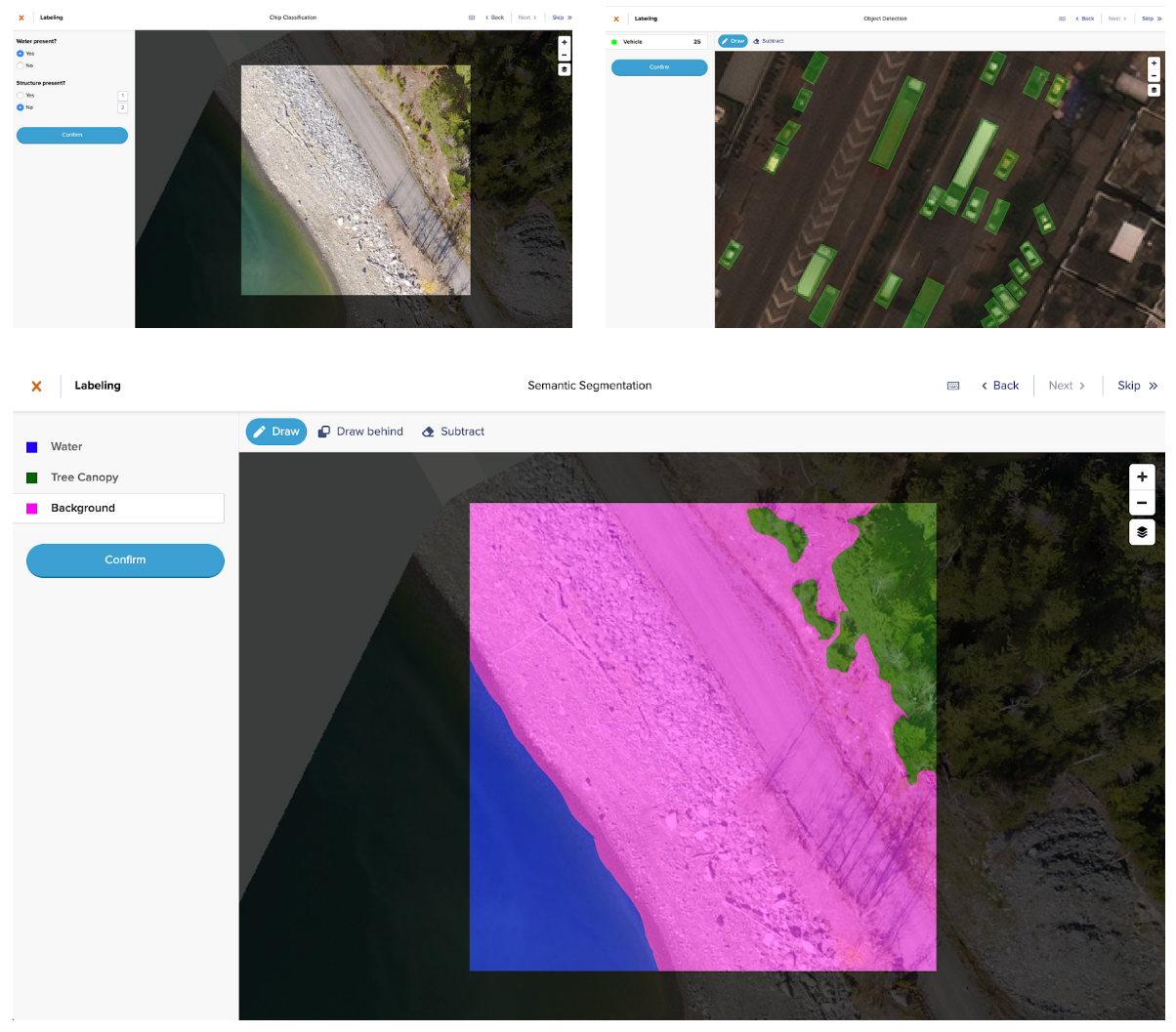 Image: Azavea
I had signed up for an account when GroundWork first launched to try it out, but this competition gave me an opportunity to really take it for a spin. It’s a rather impressive tool, both in its user experience as well as in its behind-the-scenes geospatial data handling, which I cover more in Part Two.
The labeling competition kicked off on the morning of September 8th and I got to work right after the projects were released for labeling.
Day 1
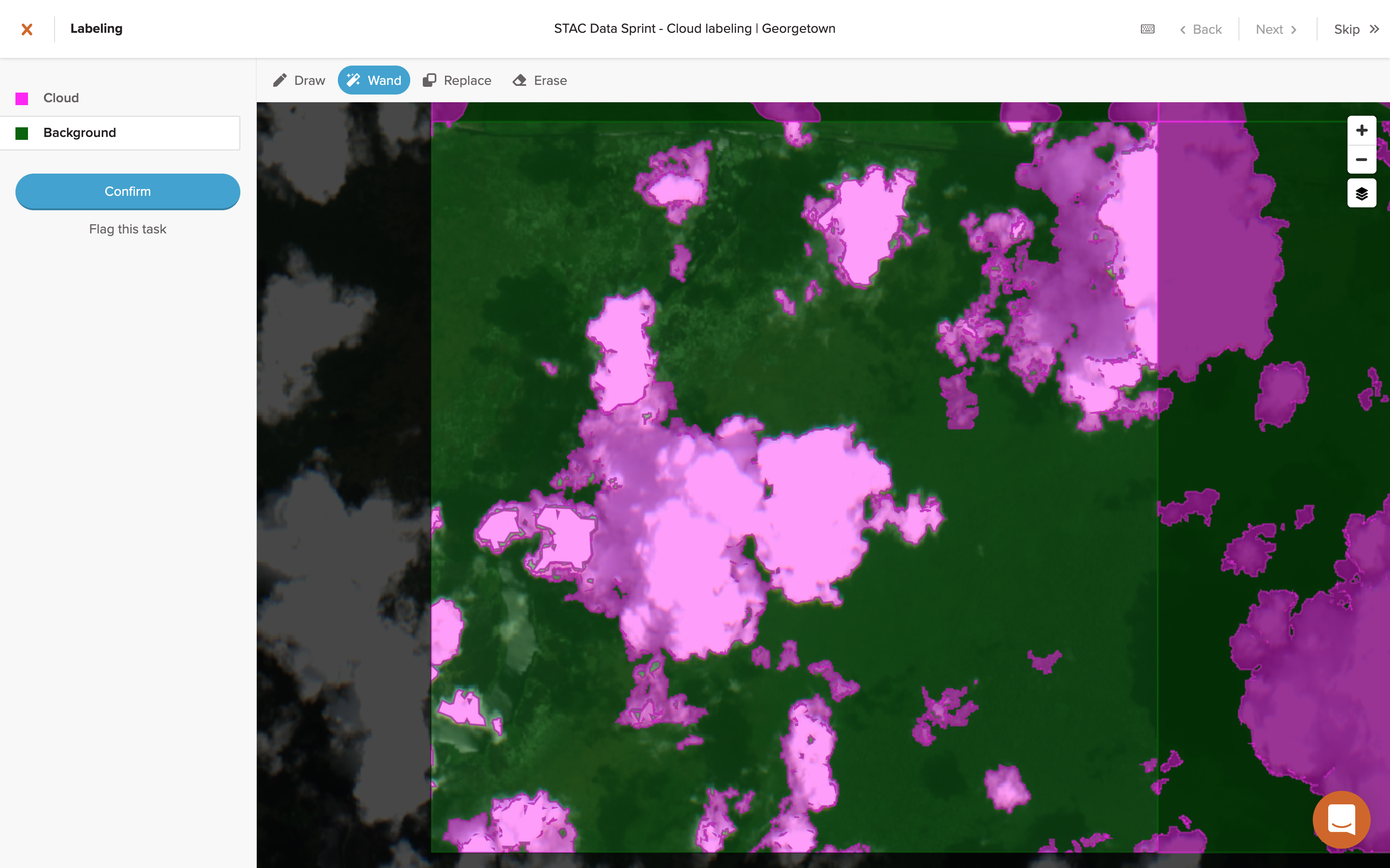
When you first sign in to the GroundWork application, you see a list of all of the projects that you have been assigned. In the case of this competition, each project is comprised of Sentinel-2 satellite imagery scenes from various locations around the world, scenes typically full of clouds that need to be labeled.
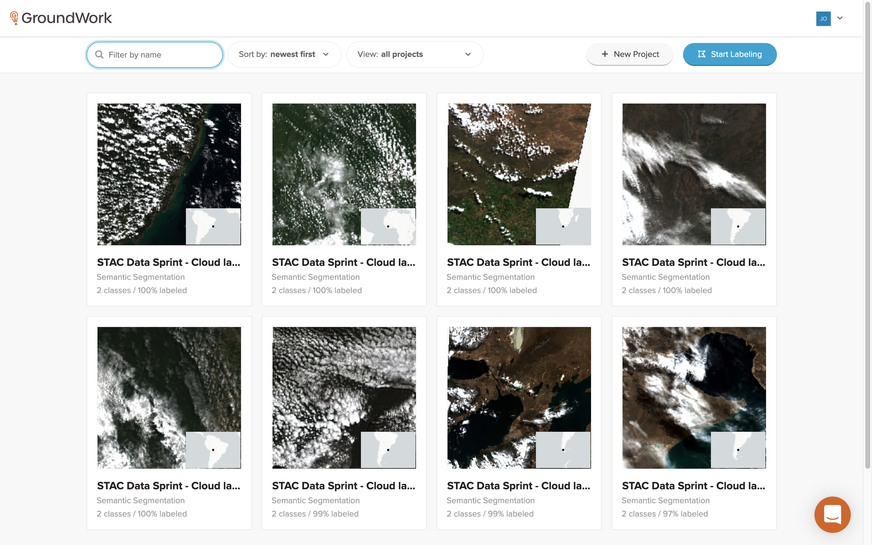
Each project shows some brief summary data, namely how many segmentation classes are available (in this case, Cloud and Background) along with a percentage of how many tasks have already been completed for each project.
Next, you just need to select a project that still has tasks to be done. Clicking on a project card brings up a specific project page that shows a more detailed map of all of the tasks for that project.
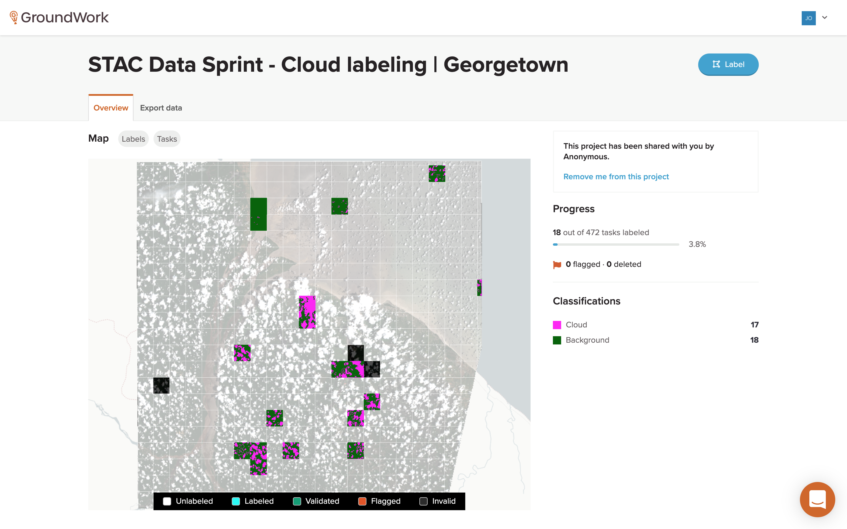
The tasks are shown as tile overlays on top of the satellite imagery that needs to be labeled. Each task is color-coded to indicate whether it’s unlabeled, labeled, validated, flagged or invalid. More detailed project progress information is also shown, along with a legend showing each of the segmentation classification categories. There’s a lot happening behind the scenes on this page, which I to plan to go over in Part Two.
To get started labeling, you just click on any available unlabeled task and it will take you to the task page.
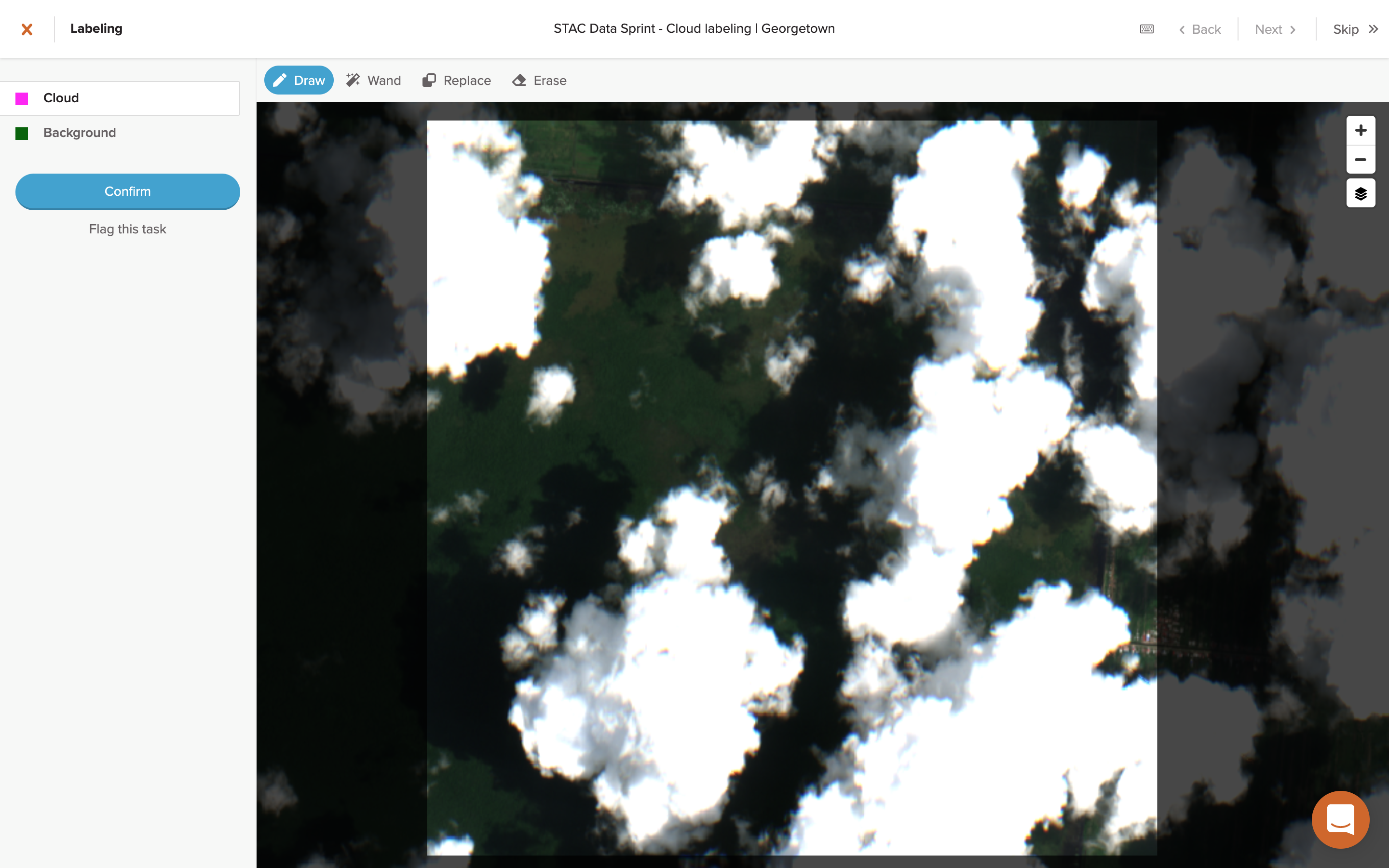
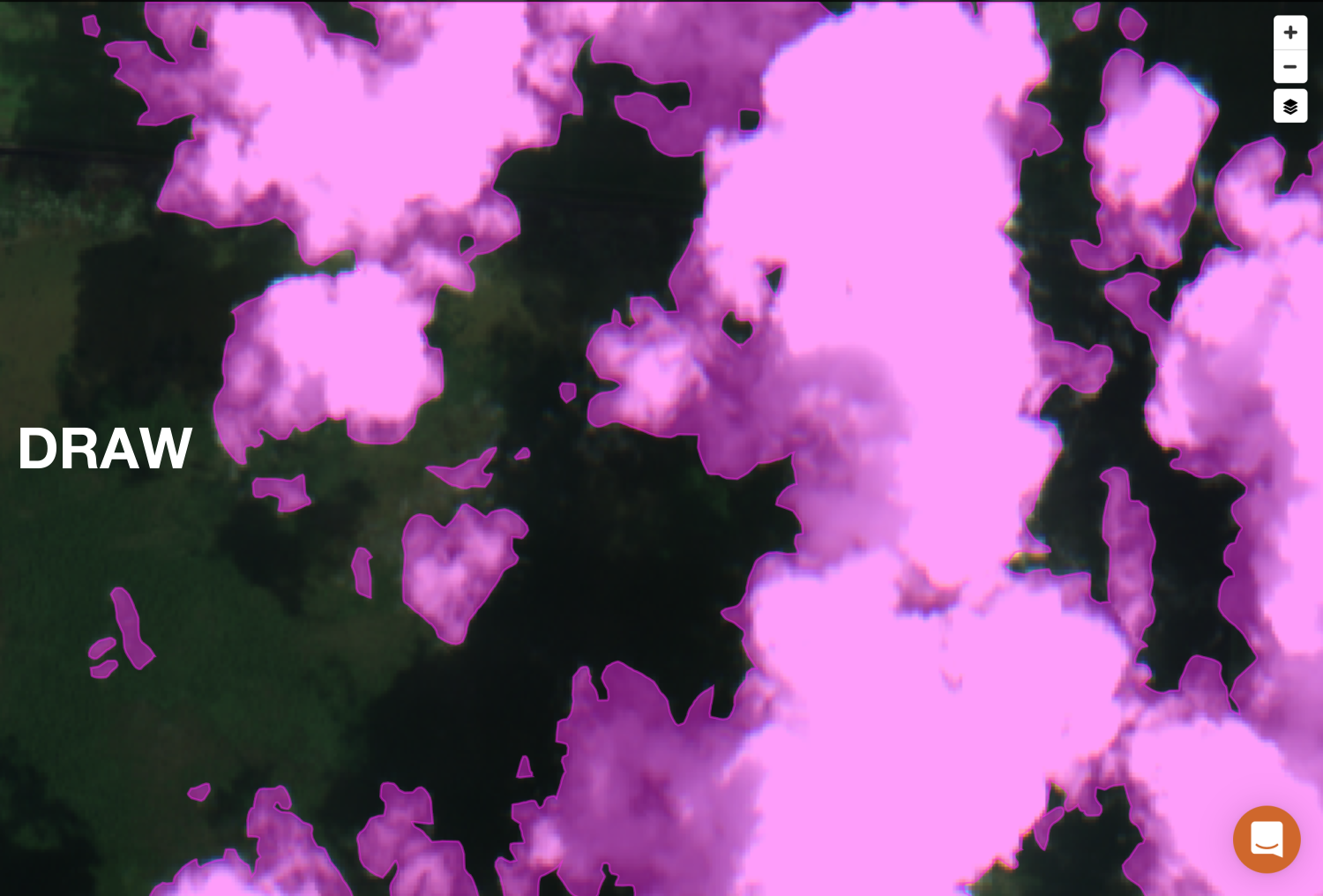
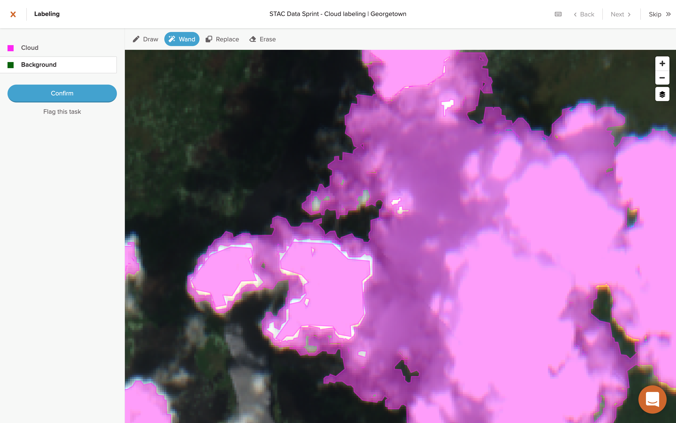
Here, you’ll see the actual satellite imagery that needs to be labeled, along with the selectors for the segmentation classification categories that you’ll be using, in this case either “Cloud” or “Background”. The aim was to find any pixels on the imagery that appeared to be clouds, then draw around those areas and label them as one of the two segmentation categories, Cloud (pink) or Background (green).
Since these are manual labeling tasks, you have a few options for how you can label pixels: drawing or the “magic” wand, along with an eraser tool. I briefly tried the wand feature, which provides an effect similar to the paint bucket tool in image editing software, but it felt difficult to use at first for some reason so I stuck with the drawing tool. After a bit of practice, I landed on a drawing technique I was pretty happy with in terms of speed vs accuracy. Here’s a clip of that technique, sped up 10x below and in real-time here (17.5 min, 26 MB).
My aim was to focus on the quality of labeling, striving for pixel perfect to the extent possible. The concept of “quality” in this context is a bit tricky though, which I’ll revisit more below.
Using this drawing method, it took me about 15 minutes for a large, complicated task (about 4 per hour), with each task submitted netting about 10-50 points. I spent a good chunk of the time this first day working on tasks and soon found myself at the top of the leader board.
But, unfortunately, at the end of the day my hand was killing me. The drawing method requires a constant mouse down hold which is brutal on your finger muscles after prolonged periods of time. On top of the that, I was starting to see other labelers quickly catching up to my score at a pace that I knew I couldn’t match with the technique that I was using. I went to bed with a lead that was slowly dwindling, knowing that I might have to rethink my strategy if I wanted to remain competitive.
Day 2
The next day, I stuck with the drawing method and tried to just keep a strong labeling pace to maintain the lead. This worked for a little while, but towards the end of the day, with my hand aching and my score having been overtaken, I took a break. I told myself that if I was behind by more than 1000 points later that evening, then I’d resign myself to not winning and just continue labeling at a more leisurely pace.
But when I checked later that evening, I was surprised to see I was only down 600 points. So I decided to give myself a little breathing room and started by looking at the scoring metric in more detail to see if there was something I was missing that might explain why I was scoring points so slowly.
 Data Labeling Contest
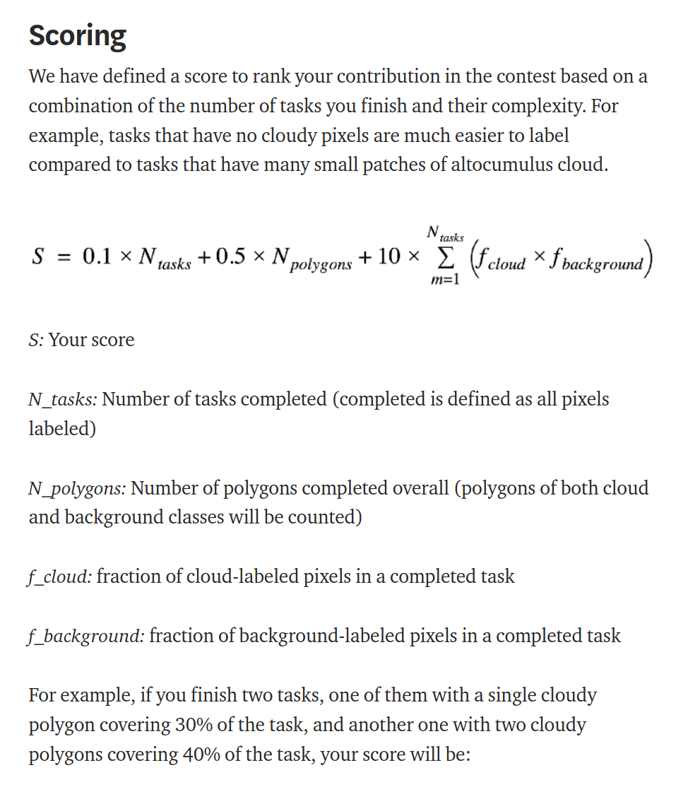
The scoring metric for the competition was comprised of three terms. The first term in the score summation was fairly straightforward, a simple low weighting (0.1) for the number of individual tasks that you had completed.
The third term is a bit more interesting at first glance. It’s a heavy weighting (10) for the summation of a fractional product, specifically the fractions of cloud and background pixels for each completed task. For a task that is half cloud pixels and half background pixels, this fractional product would have a maximum value of 0.25 (0.5*0.5=0.25). This term is intended to provide a scoring based on the relative complexity of any given task. If an easy task is either all clouds or all background, which wouldn’t take much time at all to complete, then this term would zero out (1.0*0.0=0.0 or vice versa). For any task that was anything less than half cloud / half background, the fractional product would be marginally suboptimal at some value less than 0.25, e.g. 0.75*0.25=0.1875.
At first, I thought that this scoring term was my problem. I was worried that my fractional product value was low from doing too many easy, all-background tasks as breaks in between harder tasks. I tried to balance it out by doing more all-cloud tasks, but nothing seemed to make much of a difference (even though I didn’t really have any idea what value it was anyway).
The second term was bothering me though. It looked pretty simple, a medium weighting (0.5) for the number of polygons completed overall, both clouds and background included. I’m not entirely clear on why this term was included, seeing as it seems to be mostly redundant with the third term in terms of its intent. But knowing that I tended to “close” a lot of the areas I was drawing, I knew that I was minimizing the number of polygons in any given task and that it was likely not helping my score.
After this break from labeling and with a new wind in my sails, I decided to give the competition one last shot. Knowing that the drawing method wasn’t working for either my score or my hands, I turned to the only other drawing option available: the magic wand.
Magic Wand
Azavea launched the magic wand as a new feature for GroundWork in late August 2020, only a few weeks before the labeling competition started. The purpose of the wand is to provide an easy way to select a bunch of pixels of a similar color, with a varying degree of selection sensitivity depending on how far you move the mouse cursor.
Sidenote: I was curious to know if the wand feature was a custom build or something off the shelf. A quick search for “magic wand javascript” turned up the
magic-wand-js library, an implementation of a
“scanline flood fill” algorithm. Sure enough, the LICENSE.txt file associated with a .js file in the GroundWork app includes a reference to this exact same library, so it looks like GroundWork is using it as the core of the wand feature.
Using the wand in GroundWork took a bit of practice but once you get the hang of it, the accuracy of pixel selection that it can achieve is quite impressive. Here’s a clip of the wand technique being used on the same task shown above, sped up 10x below and in real-time here (20 min, 35 MB).
With extensive use of the wand, you can gain an intuition for how it will react in different situations, allowing you to predict what areas or bands of pixels will be selected based on where you start a click (setting the initial color) and how far you drag the mouse (setting the sensitivity of the selection).
Also, using the wand method was significantly easier on my hands, since its movement mostly consists of brief mouse holds with less precise mouse movement (as compared to the drawing method), so hand fatigue was greatly reduced to the point of being barely noticeable.
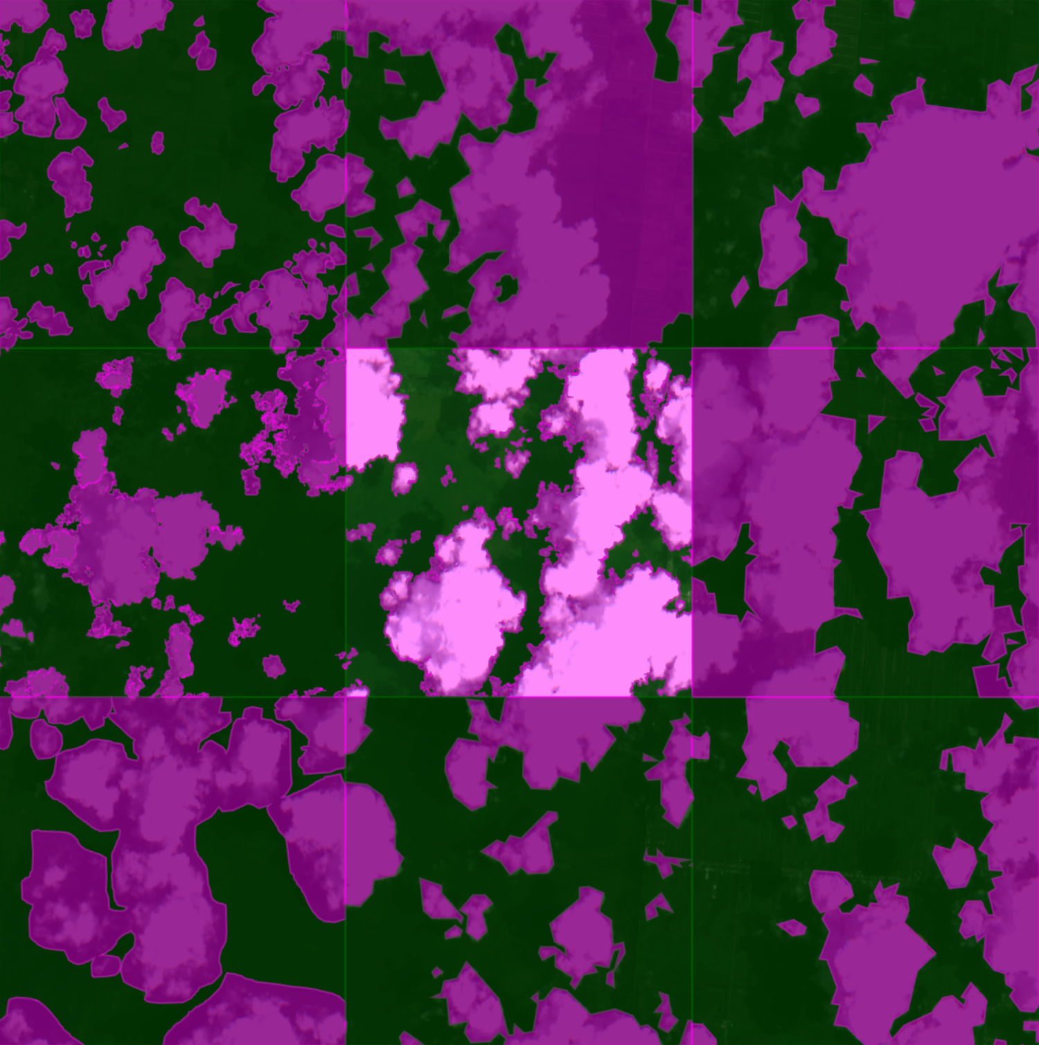
I also noticed that my time per task had slowed down a bit, up to around 20-25 minutes for a large, complicated task. Because of how readily the wand can select pixel-perfect features, I wanted to make my labels as “accurate” as possible, which took a bit more time. A zoomed-in look at some cloud feature shows the difference in pixel accuracy between the draw and wand methods.
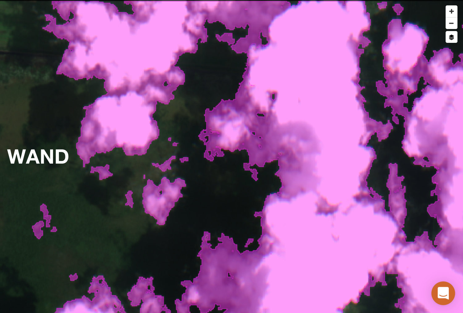
In some cases, the difference between the methods can be negligible or hard to see, especially depending on how precise you try to be using the draw method. But the flood fill algorithm of the wand can pick up on subtle hints of pixel color that the human eye can’t readily see, which becomes particularly noticeable at the faint, wispy edges of clouds and can sometimes result in pixel labels with an almost fractal-like quality.
Overall though, I think the wand feature helps to prevent an over or under classification of cloud pixels. The draw method can sometimes encourage you to over or under draw label areas, either to avoid missing features that you’re trying to capture or because of a need to trade label accuracy for speed. When using the draw method, you’ll find yourself doing either a continuous drawing motion (resulting in somewhat smooth, curved areas), or you’ll resort to the less accurate but faster method of clicking to connect points (resulting in straight, angular areas). You can see how all of these methods compare visually when looking at neighboring tasks.
After getting the hang of the wand method, I started noticing that my average score for a reasonably complex task had skyrocketed up to anywhere between 50-250+ points per task. At first, this jump in points was a little confusing. But then I realized what was going on: polygons. Or more specifically, holes.
Remember the second term in that scoring equation, 0.5 * N_polygons? Notably, this term includes polygons of all label categories, in this case both Clouds and Background. Well, it turns out that an interesting side-effect of using the wand method is a significant increase in the number of holes within the interior of a labeled area. And what are holes if not interior polygons?
Take a second look at the task comparison image above. The middle left task was done using the wand method, same as the center task. Looks pretty similar, right? Well, not once you start zooming in on that task.
See those dark bands that look almost purple in the middle of the pink clouds? Those are actually holes.
The reason for these holes is due to the wand technique I was using, namely starting at the center of the cloud to fill in the brighter pixels and then and working my outward to fill in progressive bands of darker pixels. That, plus maybe some inherent effect of applying the flood fill algorithm to the seemingly band-like colorization of cloud structures in visual satellite imagery, is what created so many holes.
However, the result of this wand side-effect creating so many more interior polygons (or holes) was a massive leap in scoring efficiency for labeling tasks. The resulting boost in scoring acted as a disincentive to close these interior holes, but I tried to maintain labeling accuracy as much as possible and close any of them where it made sense to do so, although some were still difficult to spot. In the middle left task above, I was intentionally sloppy in closing interior areas and from a macro view it’s almost impossible to tell a difference with the more judiciously labeled task to its right.
Now hitting a stride using this wand method (while still minimizing holes as much as possible), I was able to hit a good balance of accuracy and point efficiency. By the end of the 2nd day, I had significantly increased my overall score, holding (what I thought to be) a very comfortable lead.
Day 3-4
The next couple of days I spent a good bit of time labeling using the wand method which netted a good number of points. By the middle of Day 4, I had built a fairly large lead (I thought at the time) of about 7,000 points ahead of the 2nd place labeler and I was sitting comfortably on top of the leaderboard.
I thought it was smooth sailing from then on to the end of the competition and I started day-dreaming about where I was going to task that SkySat image.
End of the Line
Well, it turned out that my time at the top wasn’t to last very long. I had been keeping track of the scoring pace of other labelers and could tell they were quickly catching up to me. For a while, it appeared to me that we all had a roughly even scoring efficiency, around 1,000-1,500 points per hour. But then the other labelers started hitting a much more consistent pace, with even higher scoring efficiencies, and I started calculating that they were getting up to 2,000-3,000+ points per 15 minutes. Unable to match this bewildering pace, I knew my time at the top would soon be over.
Additionally, I started to hit some issues with the wand feature. At one point it stopped working entirely on my desktop computer (using both Firefox and Chrome, in Linux and Windows 10), freezing my browser with what appeared to be some kind of CPU or memory leak.
Switching to a laptop worked fine for a while (in both Chrome and Firefox), but even then after a while the wand started becoming painfully slow and unusable. The only diagnostics that I was able to do was to see that the mousedown event triggered by using the wand seemed to time out during the bubbling phase. At some point, I’d like to test out how much of a resource drain the magic-wand-js component is in an isolated demo map.
Regardless, with these roadblocks in front of me and the dream of winning slipping further and further away, I decided to shift gears and start documenting the labeling process and learn more about how the GroundWork tool works behind the scenes. Even though I didn’t live up to my original goal of winning the competition, I thoroughly enjoyed getting a chance to take GroundWork for spin and walked away with a real appreciation for how the tool was built.
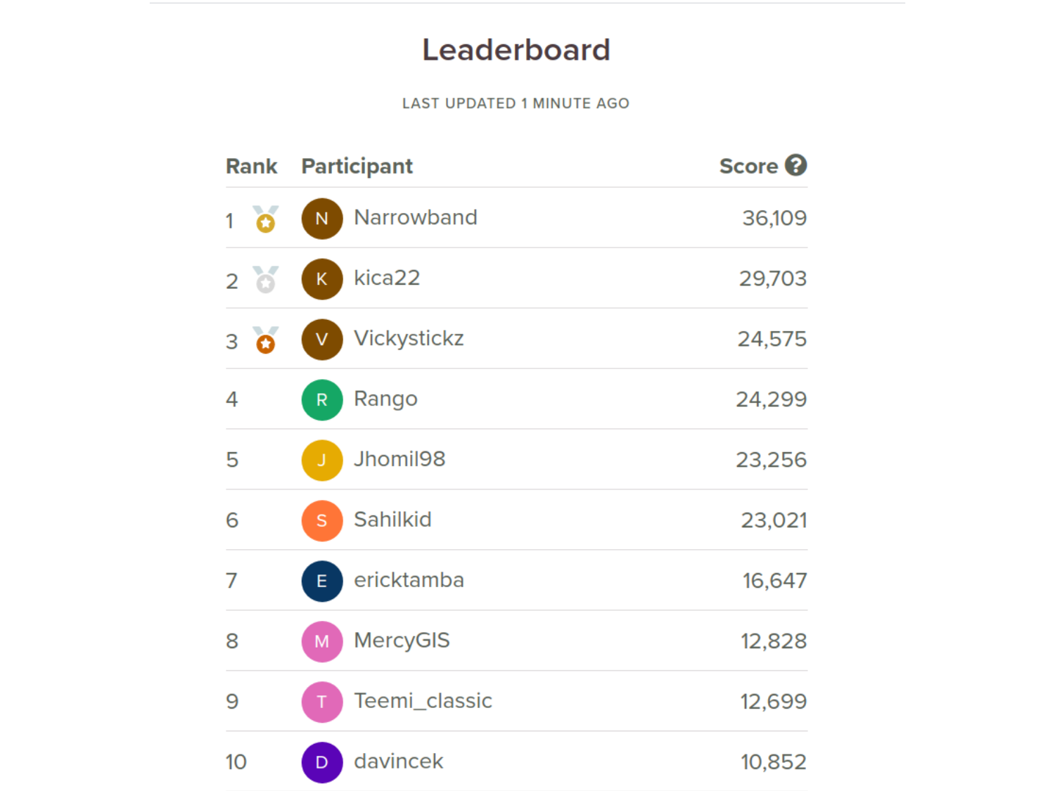
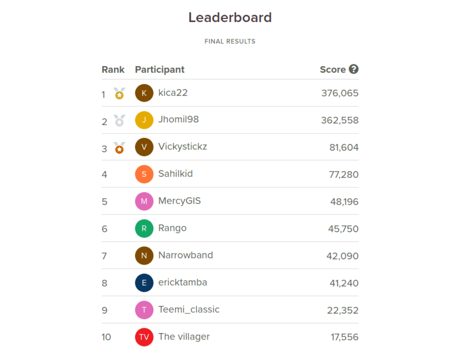
As for the final leaderboard scores? Well, take a look. I’m happy with 7th.
Thanks to the Organizers
Many thanks to the teams at Azavea and Radiant Earth for hosting the competition, with a particular shout out to Joe Morrison and Chris Brown of Azavea and Hamed Alemohammad of Radiant Earth for their support and for taking the time to answer everyone’s questions about the competition on Slack.
Also thanks to the other label competitors! I’m excited to see how the data that we all generated will be used by Azavea, Radiant Earth and others in training future machine learning models to better handle clouds in satellite imagery.
Part Two
In Part Two, I take a closer look at some of the impressive behind-the-scenes data processes in GroundWork, similar to the work I did looking into Netflix’s interactive Black Mirror episode, Bandersnatch.
- Posted on:
- September 18, 2020
- Length:
- 15 minute read, 3118 words
- See Also: