The Light Map
By Jon Engelsman
February 5, 2020
On how a tornado inspired me to make a map using NASA's "Earth at Night" satellite imagery to highlight electrical generation, transmission and distribution infrastructure for editing in OpenStreetMap.
Click here to check out the map.
Background
A tornado tore through my hometown in Ohio this past summer of 2019, passing right through the neighborhood where I grew up and where my parents still live. After being assured my parents were ok, they told me that a couple of the large electrical transmission towers in the neighborhood had fallen down due to the high winds.
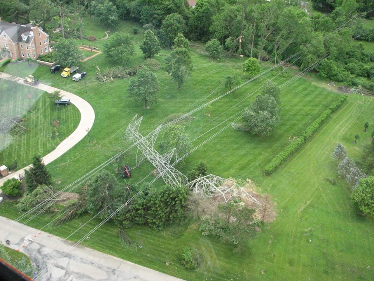
Off-handedly, they also mentioned that they thought it was weird that they still had power in the neighborhood what with the lines being down and all. Piquing my curiosity (and maybe distracting my brain a bit from the worry), I looked into why this might be the case.
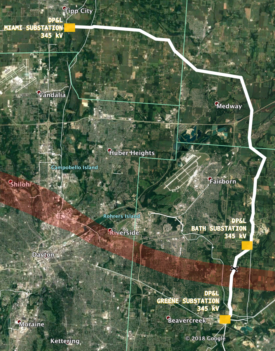
Turning to OpenStreetMap, I traced the (now damaged) power lines in the neighborhood and realized that they weren’t local distribution lines but in fact large 345 kV transmission lines. I’m pretty sure all of the distribution lines in the neighborhood are buried below ground, hence why no one lost power during the tornado. But that high voltage transmission line, originally built in 1967 by Dayton Power & Light (DP&L) to connect two substations in Tipp City and Beavercreek, just happened to cut right through my parent’s neighborhood and I’d never really thought about it until it was damaged.
Sometime after this, I began more regularly working in OpenStreetMap, making edits of houses, barns and farm buildings in rural areas of the United States. But I’d often found myself getting distracted whenever I’d notice a power pole or power line.
Whether they were small poles dotted along a farm on a rural county road or large transmission towers cutting across huge swaths of land, as soon as one caught my eye I had to follow it to see where it went. Along the way, I’d be making edits in OpenStreetMap, adding power poles as new points and then connecting them with long stretches of power lines. I’d keep going for long distances, following the lines of power poles until I would invariably stumble upon an intersecting transmission line or a substation where the line terminated.
This became…a bit of a problem. I was obsessed! I spent a lot of time making edits, but it always felt like a drop in the bucket when it came to utility data in OpenStreetMap. So I wanted to find a way to continue motivating myself to work on these edits and maybe encourage others to do the same.
What to Do
To do this, I knew I wanted to make a map. I took inspiration from Russ Garrett’s Open Infrastructure Map, which I had come across a few years before, back before I even really knew much about OpenStreetMap. The map is a great resource for visualizing global utility infrastructure as it currently exists in OpenStreetMap.
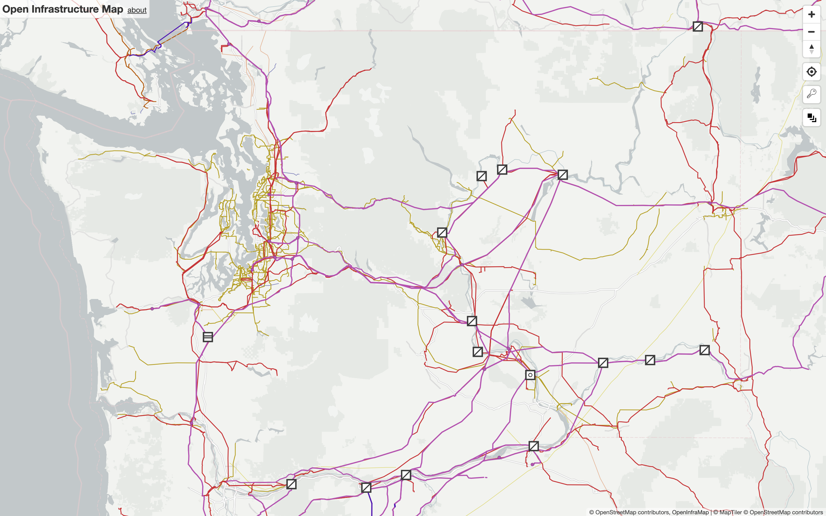 Open Infrastructure Map
By design, it does a great job of showing a wide variety of utility infrastructure data. But I specifically wanted to highlight gaps in OpenStreetMap coverage for this type of data, something to help find specific areas with missing power lines, substations or power plants, which you could then edit in OpenStreetMap.
To do this, I made the Light Map.
Light Map
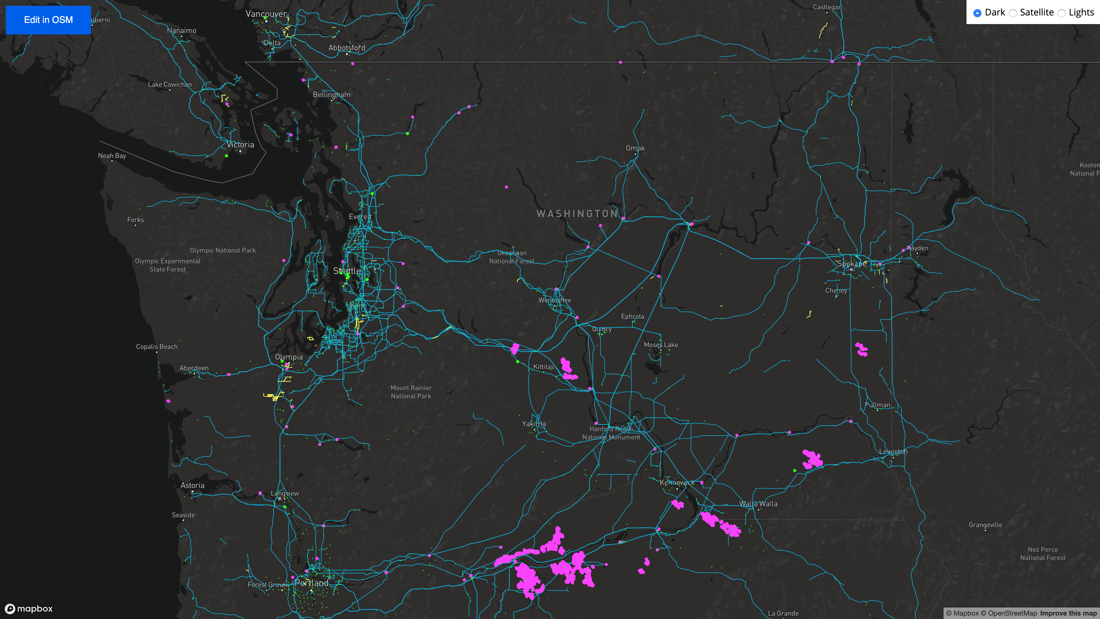
The Light Map is a prototype for visualizing electrical utility data in OpenStreetMap, data that includes power lines, power poles and high voltage towers, as well as substations and power plants.
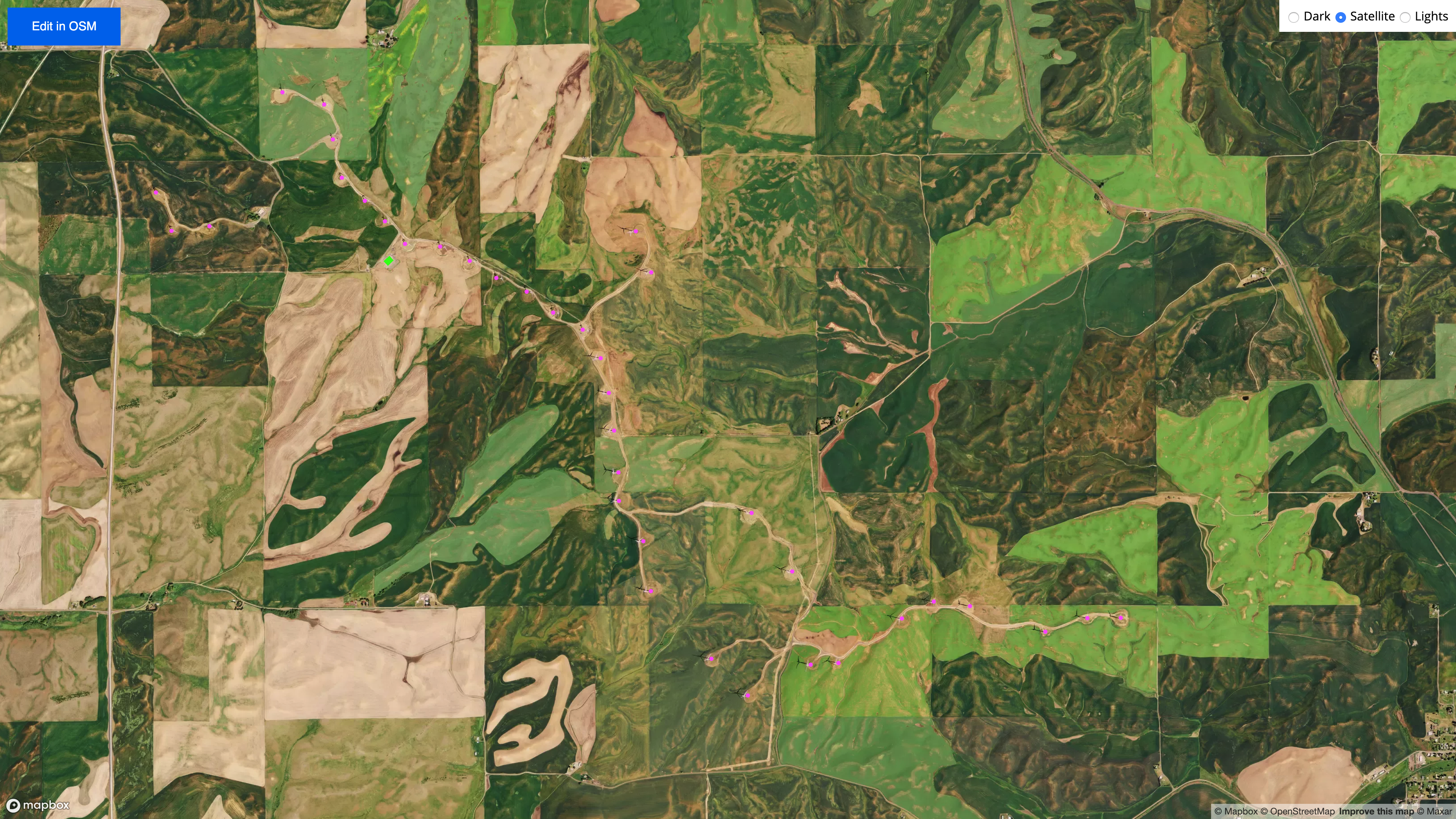
For now, the map just covers the state of Washington (my current state of residence) but at some point I’d like to extend it to all states in the US. Washington state offers a lot of interesting case studies in electrical infrastructure though, including large well-known generation facilities like the Grand Coulee Dam.
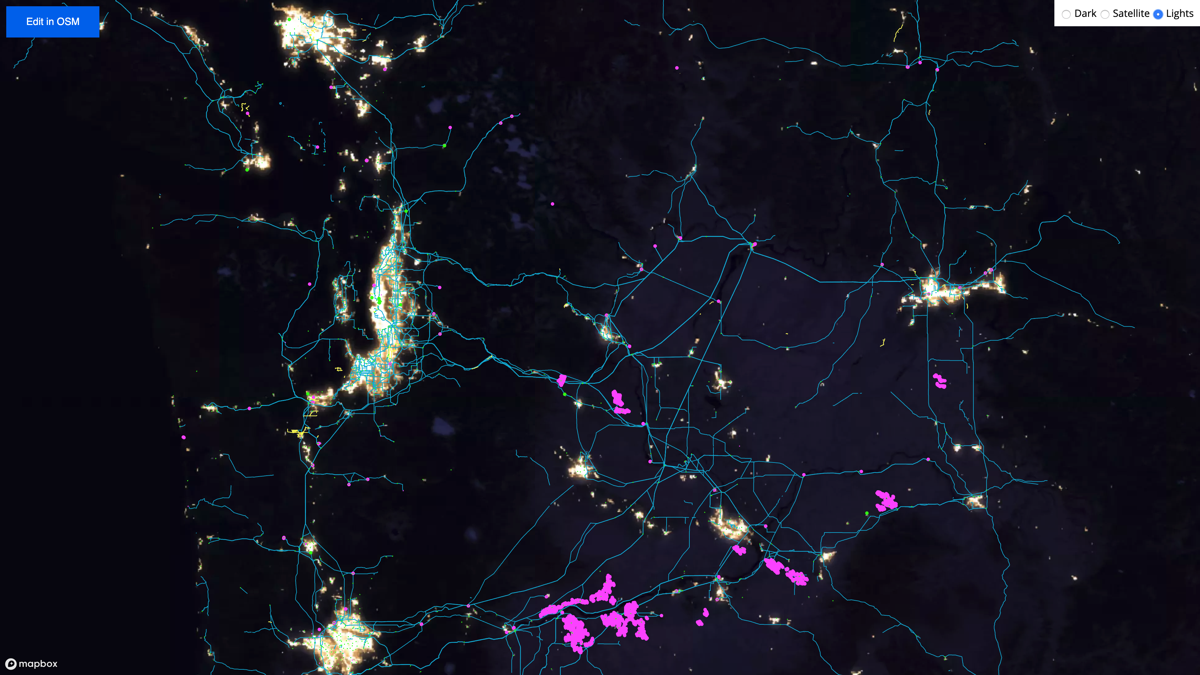
In Washington, power plants (shown in purple) are mostly made up of hydroelectric dams, making up over two-thirds of electrically generation in the state. Smaller power plants, like wind farms, are also shown scattered across countrysides throughout the state.
Power lines are also shown (in blue and white), either as continuous strings running between power plants and substations or as broken segments of missing data. Substations (shown in green) are also included, typically connected by power lines but sometimes left disconnected, inviting curiosity about the power lines that connect it and encouraging you to find and then follow their paths.
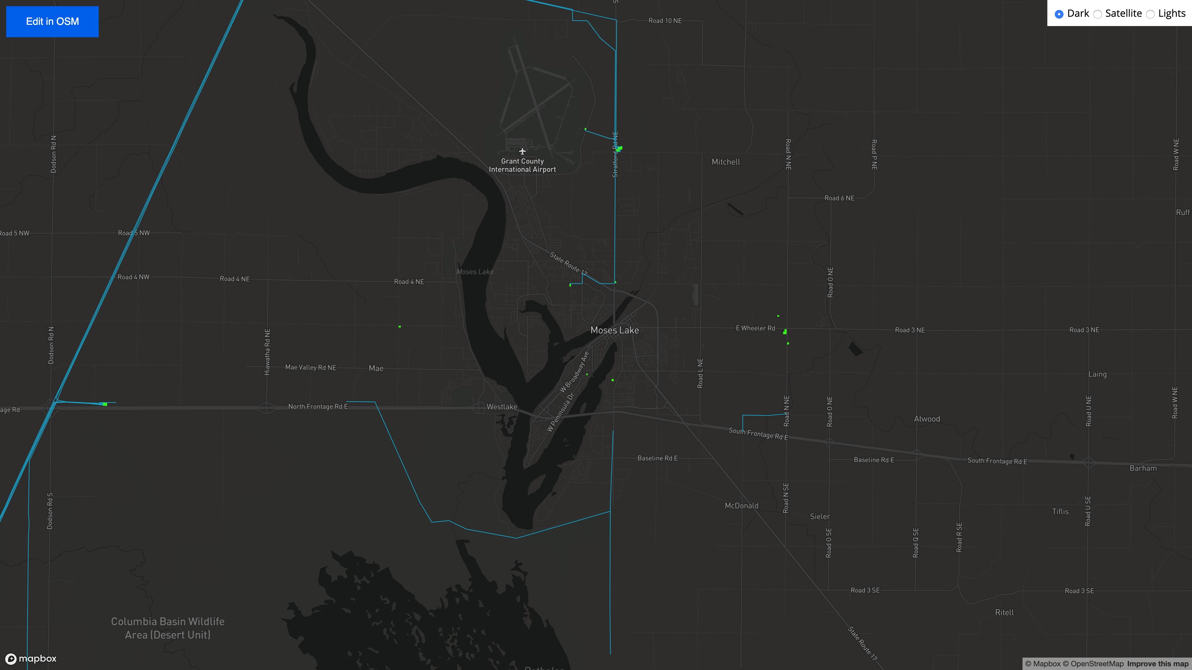
One of the intentional design elements of the map is the use of bright colors and dark backgrounds to highlight these line breaks, making disconnected or missing utility data more obvious and hopefully encouraging the user to click the ‘Edit in OSM’ button and start making edits in OpenStreetMap.
How It Works
The Light Map is built using Mapbox GL JS. Base maps are toggleable and include some standard Mapbox styles (Dark and Satellite) as well as a custom layer (Lights) that will be discussed in more detail later. Electrical utility data is from OpenStreetMap, obtained from custom Overpass Turbo queries. This utility data is then converted from GeoJSON files to a Mapbox MBTile and then used as source data for multiple vector layers in the map, stylized using the Mapbox Style Specification. Finally, an ‘Edit in OSM’ button opens up OpenStreetMap at the location and approximate zoom level of the Light Map to facilitate map editing.
Overpass Turbo
To get electrical utility data from OpenStreetMap, I used Overpass Turbo. A bounding box extent of Washington state was set as [45.336701909968134, -125.2880859375, 49.296471602658066, -116.6748046875], which was used in all Overpass queries to filter only data within the state. An example of these Overpass Turbo queries is shown below.
[out:json][timeout:25];(
  node["power"="line"](45.336701909968134, -125.2880859375, 49.296471602658066, -116.6748046875);
  way["power"="line"](45.336701909968134, -125.2880859375, 49.296471602658066, -116.6748046875);
  area["power"="line"](45.336701909968134, -125.2880859375, 49.296471602658066, -116.6748046875);
  relation["power"="line"](45.336701909968134, -125.2880859375, 49.296471602658066, -116.6748046875);
);out body;>;out skel qt;
This query was manually repeated using various Power-related OSM tags, listed below, the results of which were saved in multiple GeoJSON files.
Power Lines
Power Planets
Substations
These GeoJSON files were then merged and converted into an MBTile file using tippecanoe.
tippecanoe \
-zg -r1 -pk -pf \
-o power.mbtiles \
--no-line-simplification \
--no-tiny-polygon-reduction \
--full-detail=1 \
power-cables.geojson power-lines.geojson power-minor-lines.geojson power-plants.geojson power-substations.geojson
The MBTile was then uploaded to Mapbox Studio as a custom tileset. The resulting tileset ID was used in Mapbox GL JS to add custom layers and styling for each of the different data types (power lines, minor lines, substations, etc).
Imagery
A key feature of the Light Map is the use of night-time satellite imagery. As a background layer, with the electrical data layered in bright colors above, it helps to highlight what’s missing in the OpenStreetMap data.
Bright spots on the map, only visible at night, show where lights are scattered across the state, in obvious places like the metropolis area of Seattle all the way northeast to the small town of Metaline Falls. And when we see bright spots without any blue lines nearby, it hopefully makes us curious as to how those lights are being powered and where those transmission lines might be coming from, encouraging us to find out and then add that knowledge to OpenStreetMap.
To add this imagery to the Light Map, I turned of course to NASA. The Black Marble, aka Earth at Night, is a composite imagery set developed by Joshua Stevens using data from the Visible Infrared Imaging Radiometer Suite (VIIRS) onboard NASA’s Suomi NPP weather satellite. I’ve used this imagery set in the past with my Cupola Bot on Twitter to simulate the view from the International Space Station at night (using regular satellite imagery to simulate daytime).
This imagery is freely available at the Earth at Night: Flat Maps website. Originally, I had downloaded the 3km resolution global map (GeoTIFF, 64.4 MB) and uploaded that to Mapbox Studio as a custom layer so I could use it in the map. And that works fine.
But I later realized that Earth at Night also offers higher-resolution (500m) regional GeoTIFF’s that I could use instead. Same idea, but a higher resolution imagery means that the map will look that much nicer when zoomed in. I downloaded regions A1 and B1 (about ~300 MB each) to cover the entire United States, and then followed these instructions to merge the two GeoTIFFs into a single file using QGIS. Unfortunately, I was having an issue with QGIS being able to find my GDAL installation but luckily an error message contained a helpful command line prompt.
gdal_merge.py -ot Byte -of GTiff -o /{FILEPATH}/blackmarble.tif --optfile /{QGISPATH}/mergeInputFiles.txt
I could have used gdal_merge outside of QGIS, but since I already had a project created, I just used the option file it had already created to do the work. I copy/pasted that prompt into a local terminal and voila, I had a merged GeoTIFF! Unfortunately, the file ended up being just over 10 GB using no or low compression, which just barely exceeds the GeoTIFF upload limit for Mapbox Studio. At first, I tried upping the compression of the merge process but then realized I could clip the merged file down to the extent of the United States, thereby decreasing the overall file size. I tried using QGIS to do this but the gdal_translate process didn’t retain any color interpretations (making the clipped image look different than the original), so I manually tweaked the command until I got a final image that I liked.
gdal_translate -projwin -179.30510851397887 89.31422520765801 -51.262969129862256 11.355554219003281 -ot Byte -colorinterp_1 red -colorinterp_2 green -colorinterp_3 blue -of GTiff /.../blackmarble.tif /.../blackmarble_clipped.tif
I uploaded this now smaller clipped file (~1.7 GB) to Mapbox Studio in a custom layer, and this is now what you see in the Light Map! It adds a really striking visual elements to the electrical utility data and I’ve found that the small spots of light help motivate me to find new, unmapped areas of transmissions lines and substations that I can edit in OpenStreetMap.
Future Improvements
The Light Map is a prototype. An obvious limitation in its current state is the limited scope of data, for now just Washington state. Ideally, this will be expanded to the rest of the United States, if not globally. Additionally, the utility data is just a snapshot of what was in OpenStreetMap when I extracted the data using Overpass Turbo, already a few months stale. Ideally, I’ll build out a data pipeline that extracts utility data on a regular basis (hourly? daily?) from OSM pbf extracts, offering fresh and up-to-date data in the visualization. That way, when people make edits in OpenStreetMap after finding missing utility data, they’ll be able to see their edits reflected in the Light Map.
All that being said, I’m quite happy with how the map turned out. It was a fairly straight-forward idea that came together quite nicely, and I’m particularly happy with the night-time imagery and its combined effect with the utility data. Definitely an idea that I’d like to explore further.
Augmented Mapping
My hope is to build the Light Map out as an “augmented mapping” tool. These kinds of tools typically utilize data from satellite imagery to enhance OpenStreetMap editing workflows. If you’re interested in this topic, and in editing electricity infrastructure specifically, I’d encourage you to check out efforts by Development Seed and Facebook which both explore augmented mapping, combining satellite imagery with machine-learning processes to quickly and accurately identify existing infrastructure that can then be mapped by humans.
I’d also encourage you to start exploring and editing OpenStreetMap if you’re interested in this kind of work!
- Posted on:
- February 5, 2020
- Length:
- 10 minute read, 1959 words
- See Also: